What You'll Learn
- Load and visualize nighttime lights satellite data
- Create multi-temporal composites using the additive color system
- Interpret RGB composites where colors represent time, not wavelengths
- Identify patterns of urban growth, resource extraction, and human activity
- Use the Inspector tool to verify visual interpretations
Building On Previous Learning
This lab builds on Lab 2 where you learned about RGB composites. Now you'll apply the same concept in a new way: instead of assigning spectral bands to color channels, you'll assign different years to create a change detection composite.
Why This Matters
Nighttime lights are a unique indicator of human activity. Researchers use this data to:
- Track urbanization: Cities grow outward and become brighter over time
- Estimate population: Brightness correlates with population density
- Monitor conflict: War zones show dramatic decreases in light (e.g., Syria)
- Detect economic activity: Industrial zones and shipping lanes are visible
- Study energy access: Darkness indicates lack of electricity infrastructure
This is one of the few datasets that directly visualizes human presence on Earth.
Before You Start
- Prerequisites: Finish Lab 3 and review the Night-Time Lights overview in the weekly module.
- Estimated time: 60 minutes
- Materials: Earth Engine account, bookmarked VIIRS/DMSP datasets, and a place to jot observations for discussion.
Key Terms
- DMSP-OLS
- Defense Meteorological Satellite Program - Operational Linescan System. The original nighttime lights sensor, active 1992-2013.
- Stable Lights
- A processed band that removes ephemeral light sources (fires, lightning) to show only persistent artificial lights.
- Temporal Composite
- An RGB composite where each color channel represents a different time period rather than a different spectral band.
- Gas Flaring
- The burning of natural gas at oil extraction sites, visible as bright spots in nighttime imagery.
- addBands()
- An Earth Engine method that combines multiple single-band images into one multi-band image.
Introduction
In this lab, we will work towards applying the additive color system to bands that store non-optical and more abstract attributes. This is unlike previous labs where the colors on the screen represented slices of the electromagnetic spectrum. For this lab, we will look at nighttime lights.
The key insight is that RGB composites can represent any three variables, not just spectral bands. By putting different years into Red, Green, and Blue channels, we can see change over time at a glance.
Part 1: Loading Nighttime Lights Data
To begin, add this code to your script and run it:
var lights93 = ee.Image('NOAA/DMSP-OLS/NIGHTTIME_LIGHTS/F101993');

print('Nighttime lights', lights93);

Map.addLayer(
    lights93,
    {
        bands: ['stable_lights'],
        min: 0,
        max: 63
    },
    'Lights');
Understanding the code:
ee.Image()- Loads a single nighttime lights image from 1993stable_lights- The band containing persistent artificial light sourcesmin: 0, max: 63- The data range for this sensor (0 = dark, 63 = brightest)
The first line of the code calls the NOAA Nighttime Lights Time Series. You can learn more about it here: NOAA DMSP-OLS Nighttime Lights Catalog
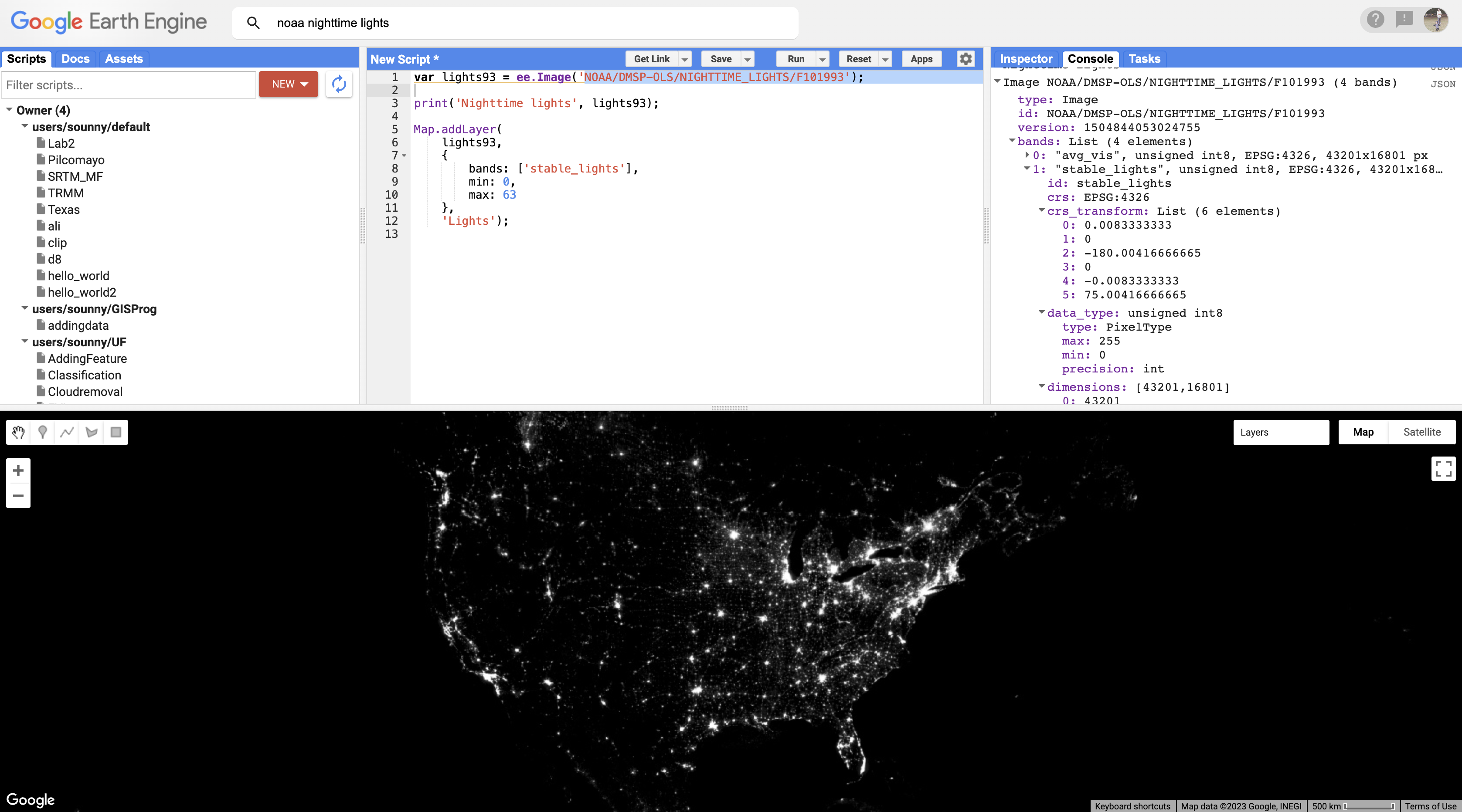
The global nighttime lights image represents the average brightness of nighttime lights at each pixel for a calendar year. For those of us who have sat by a window in an airplane as it descends to a destination at night, the scene may look vaguely familiar. But the image is very much an abstraction. It provides us with a view of the planet that we would never be able to see from an airplane or even from space. Night blankets the entire planet in darkness. There are no clouds. In the "stable lights" band, there are no ephemeral sources of light. Lightning strikes, wildfires, and other transient lights have been removed. It is a layer that aims to answer one question about our planet at one point in time: In 1993, how bright were Earth's stable, artificial sources of light?
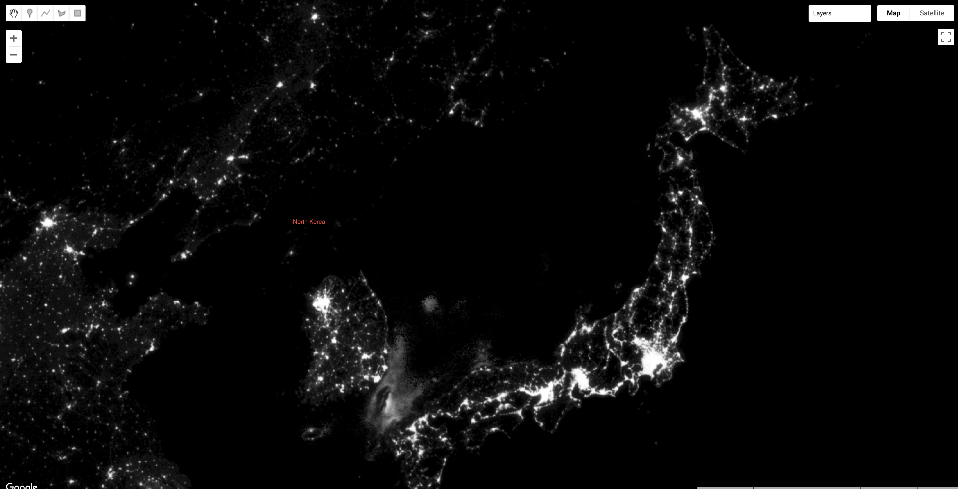
Try It
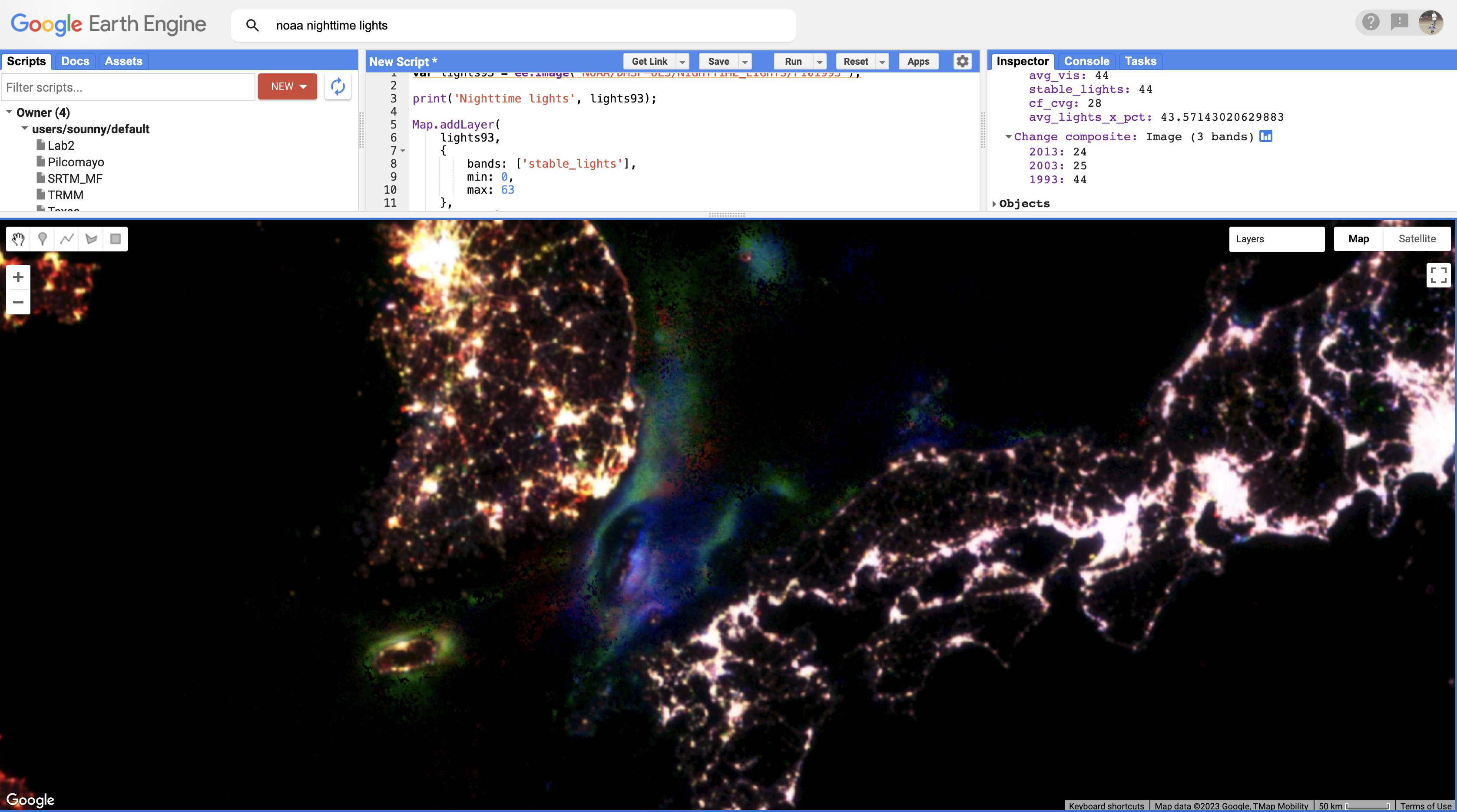
Zoom out to see the bright spot of Shanghai, the large blob of Seoul to the north and east, the darkness of North Korea except for the small dot of Pyongyang, and the dense strips of lights of Japan and the west coast of Taiwan. What stories can you already see?
Part 2: Creating a Temporal Composite
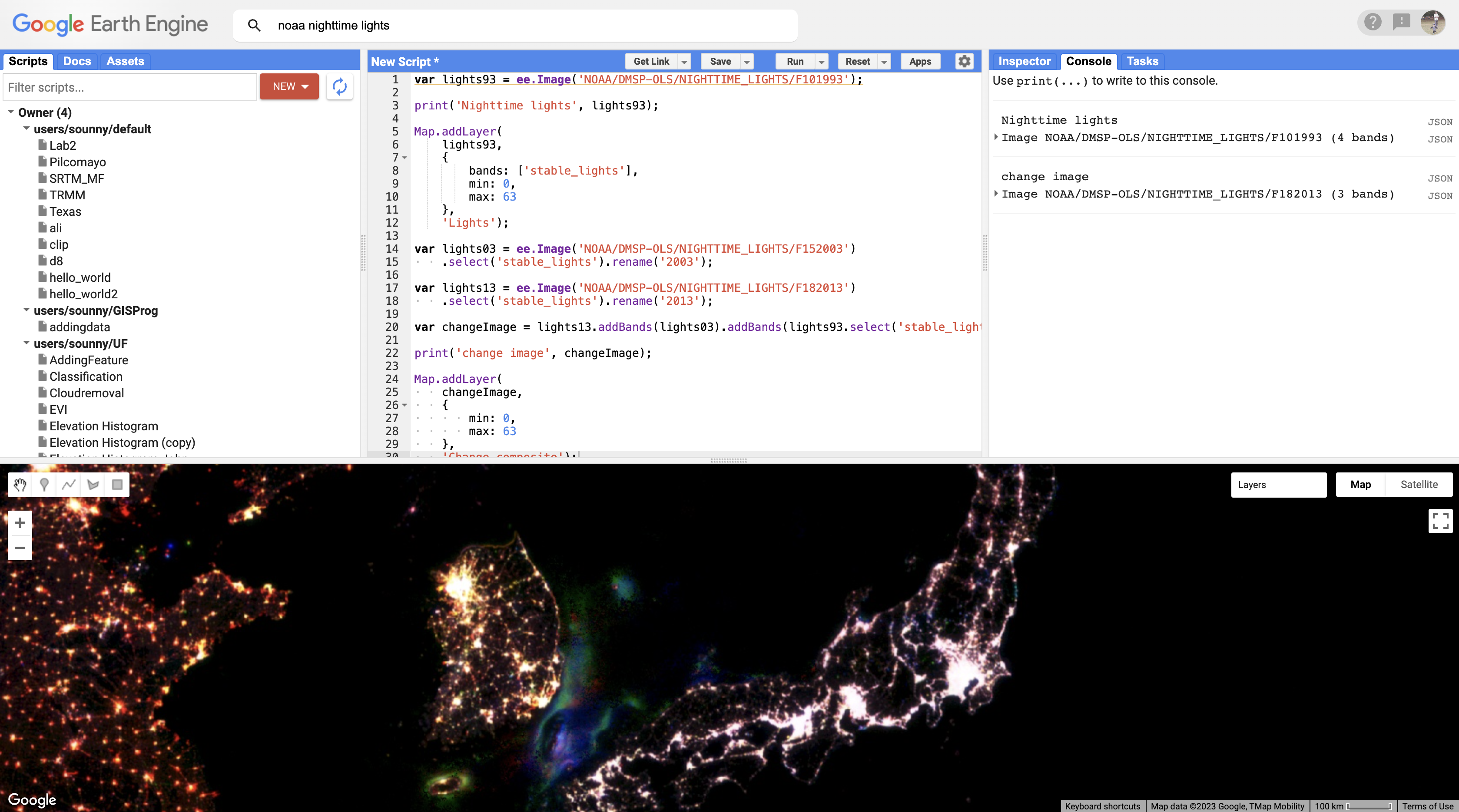
Now we can use the additive color system to make an RGB composite that compares stable nighttime lights at three different slices of time. Add the code below to your script and run it.
var lights03 = ee.Image('NOAA/DMSP-OLS/NIGHTTIME_LIGHTS/F152003')
    .select('stable_lights').rename('2003');

var lights13 = ee.Image('NOAA/DMSP-OLS/NIGHTTIME_LIGHTS/F182013')
    .select('stable_lights').rename('2013');

var changeImage = lights13.addBands(lights03)
    .addBands(lights93.select('stable_lights').rename('1993'));

print('change image', changeImage);

Map.addLayer(
    changeImage,
    {
        min: 0,
        max: 63
    },
    'Change composite');
Understanding the code:
.select('stable_lights')- Extracts just the stable lights band.rename('2003')- Renames the band to indicate the year.addBands()- Combines multiple images into a single multi-band image- The order matters: 2013 → Red, 2003 → Green, 1993 → Blue
Band Order = Color Assignment: When you have a 3-band image and don't specify bands in the visualization, Earth Engine uses the first three bands as RGB in order. Here: 2013 = Red, 2003 = Green, 1993 = Blue.
Part 3: Interpreting the Composite
We can now read the colors displayed on the layer to interpret different kinds of changes in nighttime lights across the planet over two decades:
| Color | RGB Values | Interpretation |
|---|---|---|
| White | High in all years | Bright in 1993, 2003, AND 2013 (established urban cores) |
| Yellow | High R + High G, Low B | Bright in 2013 and 2003, dark in 1993 (growth by 2003) |
| Red | High R only | Only bright in 2013 (newest growth/activity) |
| Cyan | High G + High B, Low R | Bright in 1993 and 2003, dark in 2013 (decline) |
| Blue | High B only | Only bright in 1993 (abandoned/conflict areas) |
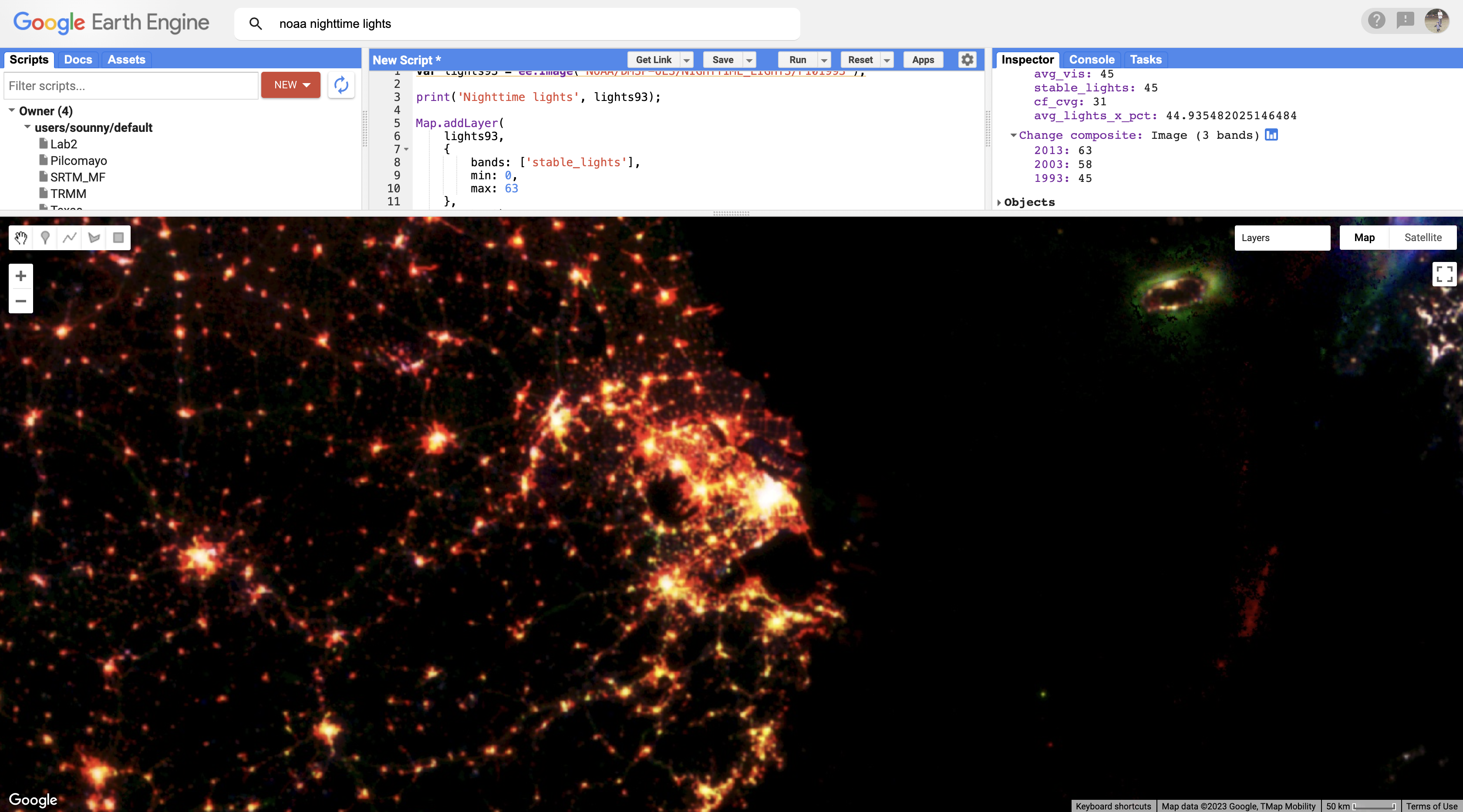
Use the Inspector panel to verify your interpretations. Click on the Inspector tab, then click on a pixel. Look under the Pixel category for the "Change composite" layer. The pixel value for each band should match your color interpretation.
Try It
Zoom into Shanghai and notice the gradient: white core (stable urban), yellow ring (growth by 2003), and red edge (newest growth by 2013). This pattern of "white-yellow-red" rings shows urban sprawl over the 20-year period.
When you zoom out from Shanghai, you will likely notice that each map layer redraws every time you change the zoom level. In order to explore the change composite layer more efficiently, use the Layer manager panel to not show (uncheck) all of the layers except for "Change composite." Now the map will respond faster when you zoom and pan.
Part 4: Patterns Beyond Cities
In addition to urban change, the layer also shows changes in resource extraction activities that produce bright lights. Often, these activities produce lights that are stable over the span of a year (and therefore included in the "stable lights" band) but are not sustained over the span of a decade or more.
Example 1: Fishing Fleets
In the Korean Strait (between South Korea and Japan), you can see geographic shifts in fishing fleets that use bright halogen lights to attract squid and other sea creatures toward the water surface and into their nets. Bluish pixels were likely fished more heavily in 1993 and became used less frequently by 2003, while greenish pixels were likely fished more heavily in 2003 and less frequently by 2013.
Example 2: Gas Flaring
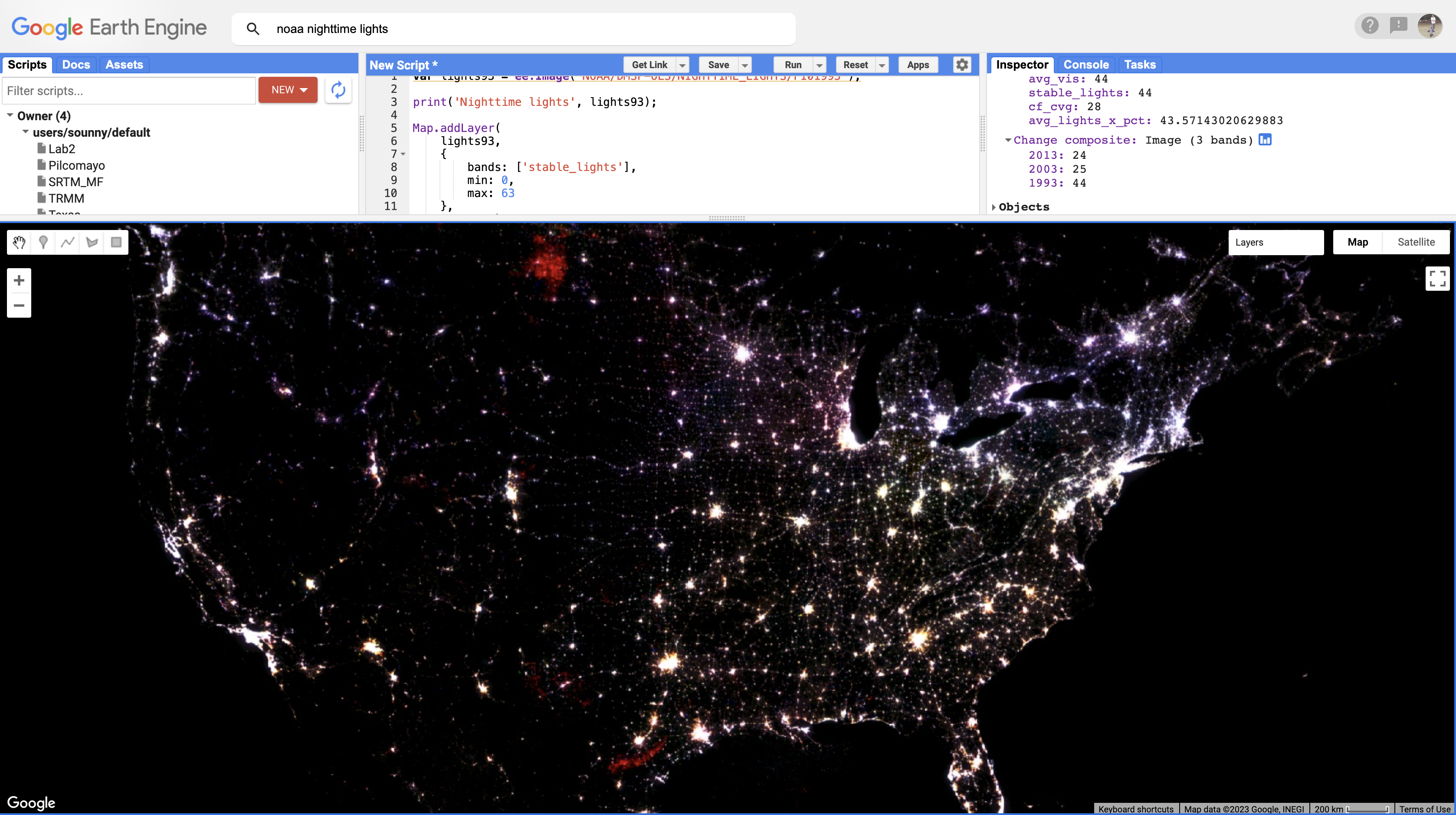
Similarly, fossil fuel extraction produces nighttime lights through gas flaring. If you pan to North America, red blobs in Alberta and North Dakota and a red swath in southeastern Texas all represent places where oil and gas extraction were absent in 1993 and 2003 but booming by 2013.
As you explore this image, remember to check your interpretations with the Inspector panel by clicking on a pixel and reading the pixel value for each band. Refer back to the additive color figure to remember how the color system works.
Check Your Understanding
- In the change composite, what does a red pixel indicate about that location?
- Why would a city appear white while its suburbs appear yellow?
- If you saw bright blue pixels in Syria, what might that indicate?
- How is this temporal composite different from the spectral composites in Lab 2?
Key Takeaways
- RGB composites can represent any three variables, not just spectral bands
- Temporal composites show change over time using color
- The band order determines color assignment (first = Red, second = Green, third = Blue)
- Use the Inspector tool to verify your color interpretations
- Nighttime lights reveal urbanization, resource extraction, and human activity patterns
Pro Tips
- Uncheck other layers in the Layer manager for faster zooming and panning
- The newer VIIRS sensor (2012-present) has higher resolution than DMSP
- You can create temporal composites with any data - NDVI, temperature, etc.
- Try reversing the band order to make different changes stand out
📋 Lab Submission
Subject: Lab 4 - Night Time Lights - [Your Name]
Submit the following in a Word document:
- URL of your Code (10 points)
- Damascus vs. Amman: Compare and contrast the changes in nighttime lights around Damascus, Syria, versus Amman, Jordan. How are the colors for the two cities similar and different? How do you interpret the differences? Include screenshot. (10 Points)
- Port Harcourt, Nigeria: Look at the changes in nighttime lights in the region of Port Harcourt, Nigeria. What kinds of changes do you think these colors signify? What clues in the satellite basemap can you see to confirm your interpretation? Include screenshot. (10 Points)
- Band Order: In the nighttime lights change composite, we did not specify the three bands to use for our RGB composite. How do you think Earth Engine chose the three bands to display? How do you think Earth Engine determined which band should be shown with the red, green, and blue channels? (10 Points)
- Your Discovery: Find an area of the world with an interesting nighttime lights story. Explore the data and see what you can find. Showcase it with a screenshot and explanation of why we are seeing what we see in the composite. (10 Points)
Total: 50 Points