Engaging with the Public
Communicating Remote Sensing Science
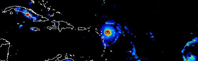
Figure: Animation showing a three-day progression of Atlantic hurricanes in September 2017
Introduction
Welcome to the Engaging with the Public module of your remote sensing course, where you will learn how to translate your work to the public and engage with the community.
Throughout the course, you have made excellent progress, learning about different aspects of remote sensing and working with Google Earth Engine. You have explored creating indices, working with elevation models, performing classifications, and honing your skills in JavaScript programming.
In this module, we will explore how to showcase your scientific products to the public in a manner that is engaging and easy to understand.
Why Public Engagement Matters
As scientists and geographers, sharing our findings with the public is crucial for several reasons:
- Education: Help people understand environmental changes affecting their lives
- Policy Impact: Inform decision-makers with accessible visualizations
- Public Awareness: Raise awareness about climate change, deforestation, urbanization, etc.
- Funding & Support: Demonstrate the value and impact of remote sensing research
- Collaboration: Engage citizen scientists and local communities
- Transparency: Make scientific data accessible to all
Module Components
This module consists of two labs that teach you powerful techniques for public engagement:
Lab 19: Making Animations
Lab 19 - Making Gifs and Videos of Environmental Change
Learn how to create compelling animations using Google Earth Engine. These animations are:
- Incredibly popular on social media
- Excellent for highlighting environmental changes over time
- Easy to share and understand without technical knowledge
- Perfect for showing temporal patterns (deforestation, urban growth, glacier retreat, etc.)
Lab 20: Web Applications
Lab 20 - Design UI/UX and Deploying Google Earth Engine Apps
Learn how to create interactive web applications that:
- Provide non-skilled users with easy-to-use interfaces
- Allow interaction with scientific products
- Enable exploration of data without coding
- Can be shared with stakeholders, policymakers, or the public
Principles of Effective Science Communication
1. Know Your Audience
- What is their level of technical knowledge?
- What do they care about?
- What format will resonate with them (animation, interactive map, static graphic)?
2. Tell a Story
- Start with a compelling hook
- Show change over time
- Provide context and meaning
- End with implications or calls to action
3. Simplify Without Oversimplifying
- Remove unnecessary jargon
- Focus on key findings
- Use intuitive visualizations
- Provide layered information (simple overview + details on demand)
4. Make It Visual
- Use clear, high-quality imagery
- Choose intuitive color schemes
- Add labels, legends, and scale bars
- Show before/after comparisons
5. Make It Interactive (When Appropriate)
- Let users explore data themselves
- Provide filters and toggles
- Enable zooming and panning
- Include clickable elements for more information
Types of Public-Facing Products
Animations & Videos
Best for: Showing change over time, going viral on social media
Examples:
- Urban sprawl over 30 years
- Seasonal vegetation changes
- Glacier retreat
- Drought progression
- Wildfire spread
Interactive Web Apps
Best for: Allowing exploration, engaging stakeholders, decision support
Examples:
- Real-time wildfire monitoring
- Flood risk assessment tools
- Vegetation health dashboards
- Land cover change explorers
Static Visualizations
Best for: Reports, presentations, publications
Examples:
- Maps showing classification results
- Charts comparing change across regions
- Before/after image pairs
- Infographics summarizing findings
Data Dashboards
Best for: Ongoing monitoring, operational systems
Examples:
- Agricultural monitoring systems
- Water quality tracking
- Urban heat island monitoring
- Deforestation alerts
Best Practices
Design Considerations
- ✅ Use high contrast for text and graphics
- ✅ Choose colorblind-friendly color palettes
- ✅ Ensure mobile responsiveness
- ✅ Optimize loading times
- ✅ Include citations and data sources
- ✅ Add contact information or feedback mechanisms
Content Guidelines
- ✅ Start with a clear title and description
- ✅ Define technical terms when first used
- ✅ Provide scale and context
- ✅ Explain what users should notice or learn
- ✅ Link to more detailed information
- ✅ Include disclaimers about data limitations
Distribution Strategies
- 📱 Share on social media with engaging captions
- 📧 Email to stakeholder lists
- 🌐 Embed in websites or blogs
- 📰 Pitch to media outlets
- 🎓 Present at community meetings
- 📊 Include in reports and presentations
Examples of Successful Public Engagement
NASA Worldview
Interactive tool for exploring satellite imagery: worldview.earthdata.nasa.gov
Global Forest Watch
Near real-time deforestation monitoring: globalforestwatch.org
Climate Engine
Interactive climate and remote sensing data explorer: climateengine.org
Earth Engine Apps Gallery
Collection of public-facing GEE applications: earthengine.app
Getting Started
Ready to create your own public engagement products? Here's your path forward:
- Complete Lab 19: Create compelling animations of environmental change
- Complete Lab 20: Build an interactive web application
- Apply to your project: Consider how you can make your final project accessible to non-experts
- Share your work: Post your products and get feedback
- Iterate: Refine based on user responses
Resources
- Earth Engine Apps Guide
- Earth Engine Video Guide
- ColorBrewer - Colorblind-safe palettes
- NASA Earth Observatory - Examples of excellent science communication
Remember
Your remote sensing work has value beyond academia. By creating engaging, accessible products, you can:
- 🌍 Increase environmental awareness
- 📊 Support evidence-based decision-making
- 🤝 Build bridges between science and society
- 💡 Inspire the next generation of Earth scientists
- 🎯 Make real-world impact with your research