Let's go ahead and add some parameters to the Map.addLayer() function to make this look better. If
you remember back to cartography 101, one of the 'rules' of cartography is that if someone looking at it for the
first time can't tell within the first 5 seconds what is being visualized, you haven't made a useful map. While
this is a bit extreme, it's an excellent goal to aim for. This is made all the harder because, at the moment,
GEE doesn't support legend creation. There are, of course, any number of different ways to visualize a map, but
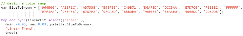
one of my personal favorites is a Blue to Brown color scheme. This is also a fairly common choice in water
trends, with dark blue indicating large increases and dark brown indicating large decreases. Use the inspector
to poke around the linear fit data and find good min and max values (I settled on -0.03 and 0.03). Because we
did this at a yearly interval, the slope units are percent change. And because we have (theoretically) 365 days,
a slope of ~0.03 equates to about 10 days/year (365*0.03) and about 90 days over the ten-year period (a quarter
of a year increase or decrease!).
Create a palette variable, and use a color gradient generator to build an evenly spaced color palette. GEE will automatically stretch this palette across the min and max values, so ensure the number of values is odd, so that 0 values have a color assigned to them (in this case, pure white). Our final map call will look something like this:
Now that we have a good-looking map, it's time to export it to our Google Maps Engine to share it with the world.