The Cartographic Communication Channel
Cartography is the process of encoding geographic reality into an abstract graphic language. The user's job is to decode those symbols to build their own mental model of the world.
The Essential T.O.L.S. (TALLS)
Every professional map should contain these five key elements. Without them, a map is just an illustration.
- T - Title: Clear, concise, and tells the "What, Where, and When."
- O - Orientation: A north arrow or graticule (especially for large scales).
- L - Legend: The key that unlocks the meaning of every color and symbol.
-
S - Scale: A way to measure distance (Scale Bar is best for digital).
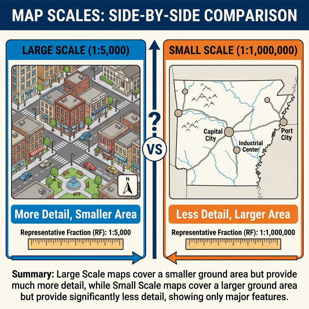
Visualizing Scale: Large Scale = Small Area (Detailed). Small Scale = Large Area (General).
- S - Source: Where did the data come from? (e.g., "Source: NOAA").
Levels of Measurement
Before choosing a color scheme, you must understand your data's structure. In 1946, psychologist Stanley Smith Stevens defined four levels of measurement that dictate how we can map data:
Examples: Soil types, Place names, Phone numbers (961-8224 is not "more" than 961-8049).
Map Choice: Qualitative colors (e.g., Land Use).
Examples: Race results (1st, 2nd, 3rd), High/Medium/Low, Likert scales.
Map Choice: Sequential colors or size (e.g., Hazard Risk).
Examples: Temperature in Celsius (0°C is not "no heat"), Time of day.
Map Choice: Diverging or Sequential colors.
Examples: Population density, Distance, Income ($0 means no income).
Map Choice: Sequential colors or Proportional Symbols.
The Power of Classification
Changing how you group data (Classification) can drastically change the story a map tells. This is often how maps "lie."
Below is a grid of 20 districts with unemployment rates ranging from 2% to 12%. Click the buttons to change the classification method.
The Psychology of Color
Color is one of the most powerful tools in a cartographer's belt, but it must be used with precision based on your data's level of measurement.
Sequential (Low to High)
Used for quantitative data that goes in one direction (e.g., Income, Population).
Diverging (Opposite Ends)
Used for data with a meaningful midpoint (e.g., Above/Below Average, Temperature).
Qualitative (Categories)
Used for categorical data with no order (e.g., Soil Types, Land Use).
Common Thematic Map Types
Depending on your data's geometry (points, lines, polygons) and measurement level, you can choose from these standard map types:
1. Choropleth Map
Polygons shaded by value (e.g., Population Density per County). Requires normalized data (rates/ratios), not raw counts.
2. Proportional Symbol
Circles or squares scaled by magnitude (e.g., City Population). Good for raw counts.
3. Isoline (Contour)
Continuous lines connecting points of equal value (e.g., Elevation or Temperature). Best for continuous fields.
4. Dot Density
Dots randomly placed within polygons to show density (e.g., 1 dot = 500 people). Excellent for showing concentration.
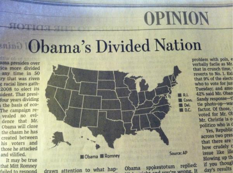
The "Blueberry in Tomato Soup" Myth
Maps shape political reality. For years, the cartographic standard for U.S. election maps painted entire counties "Red" or "Blue" based on the majority vote.
The Visual Lie
Texas Governor Rick Perry once famously described Austin as a "Blueberry in a bowl of Tomato Soup." Source: CultureMap Austin
Why? Because on a standard map, the large rural counties (Red) dominate the visual area, while the dense urban center of Austin (Blue) appears as a tiny dot. It creates the illusion that the state is 90% Republican, even if the population split is much closer (e.g., 52% vs 48%).
The Cartographer's Fix: "Purple America"
To tell the truth, we must stop thinking in binary (Red vs. Blue). By using Continuous Gradation (mixing red and blue based on vote % to create shades of purple), a very different map emerges. We see that there is no such thing as a "Red State" or "Blue State"—just specific urban cores and rural gradients.
The Tornado Trap: Why You Must Normalize
Imagine you are a Senator wanting to build a National Tornado Research Center. You look at a map of "Total Tornadoes by County."
The Reality: Harris County is just huge. It's bigger than the state of Rhode Island.
Because it covers more land, it captures more tornadoes. This is the MAUP (Modifiable Areal Unit Problem) striking again. If you don't Normalize your data (e.g., "Tornadoes per Square Mile"), you are simply making a map of "Where the Big Counties Are" or "Where People Live."
The Fix: Always divide your count by Area (Density) or Population (Per Capita) before mapping!
Goals of Good Map Design
Six fundamental elements comprise what makes good map design. These principles often work together, but can sometimes conflict. The goal of a good map is to balance each of these elements. When conflict does occur, emphasize only those that are most important to the purpose of the map.
👁️ 1. Clarity
The ability of the map to convey its message clearly.
- Fully examine the objectives of the map and emphasize the important points
- Avoid overloading with too many details that don't contribute to the overall objectives
- When considerable detail must be included, consider using tables for textual-type data
- Textual elements should take precedence over line work—break lines where text crosses
- Avoid breaking lines in areas involving multiple bends; use straight portions for text placement
🔢 2. Order
The logic of the map; the path that the eye follows when viewing a map.
- Avoid areas on the map that are cluttered and confusing
- Avoid making auxiliary map elements (scale bars, north arrows, legends) too large or overly prominent—they are not the main subject
- Use line weights, colors, and font attributes to draw attention to important elements (e.g., title, index contours)
- Except in extreme situations, always align the edges of the map with the cardinal directions
⚖️ 3. Balance
Refers to the visual balance of the map layout.
- The visual center of the map is slightly above the physical center
- Try to center the subject of the map on the visual center
- Align the longer dimension of the subject area with the longer dimension of the map sheet
- Balance can be achieved using line weights, fonts, and colors:
- Thicker lines appear heavier
- Bold text makes elements feel heavier
- Red text appears heavier than yellow
◐ 4. Contrast
The use of line weights, font characteristics, and colors to differentiate elements.
- Contrast can enhance balance, order, and clarity
- Use larger, bold fonts for the title of the map
- Use yellow, thin lines to de-emphasize contours when required for legal purposes but not the main focus
- Index contours should be drawn with heavier lines and "heavier" colors than intermediate contours
🔗 5. Unity
The interrelationship between backgrounds, shading, font characteristics, and colors.
- Be aware that colors are subjective and inter-related
- Yellow text on a white background will de-emphasize the text
- Yellow text on a black background will emphasize the text
- All elements should feel like they belong to the same design system
🎵 6. Harmony
The interrelationship between all elements on a map.
Common errors that break harmony:
- Use of too many font styles
- Use of too much color
- North arrows that are too large in comparison to other elements
- Graphical scales that are too large in comparison to other elements
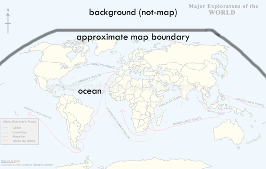
🔍 Spot the Problem: Real-World Bad Maps
The best way to learn good cartographic design is to study bad examples. Below are real maps found "in the wild" that violate one or more principles of good map design. Can you identify what's wrong with each one?
Click on each map to reveal the answer, then think about which of the six design principles (Clarity, Order, Balance, Contrast, Unity, Harmony) were violated.

Summary of Big Ideas
- Visual Hierarchy guides the user's eye to the most important data.
- TALLS elements provide the necessary context for map interpretation.
- Choropleth maps must be normalized to avoid misleading population-concentration artifacts.
- Generalization is the necessary simplification of geography for specific scales.
Chapter 02 Checkpoint
1. Which color scheme would you use to map "Percent Unemployment by County"?
2. What does "TALLS" stand for in map design?